Cartographers rely on the authority of maps to communicate locations, guide navigation at sea, and shape people’s perceptions of Earth. However, because all flat maps have compromises built into them, they represent both reality and distortion.
When looking at a rectangular world map, you see an illustrated view of Earth, the surface of the planet, as well as a graphic representation of the continents and oceans, along with their relative sizes, shapes, and distances. But the size, shape, and distance of all the continents and oceans on a rectangular world map are actually distorted by design. These distortions affect the way we view geography, culture, and the relative importance of regions around the globe.
The fundamental problem with world maps is the difference between the shape and form of the planet. Earth is round; however, flat paper maps are rectangular. When converting a round object to a flat surface, distortion is unavoidable. That means that cartographers have to decide which aspects of the map should be preserved in their original form, accurate, and which aspects should be distorted, less accurate.
Cartographers have created various types of maps that preserve attributes such as direction, area, or shape, but ultimately there is no way to preserve all aspects of Earth’s surface on a flat map.
The fact that a single object can look different depending on how it is represented is critical. As people continue to see the world through maps, people come to view regions as larger or smaller than their actual size. These relationships between regions have a profound effect on people as they grow accustomed to viewing others based on geographic size.
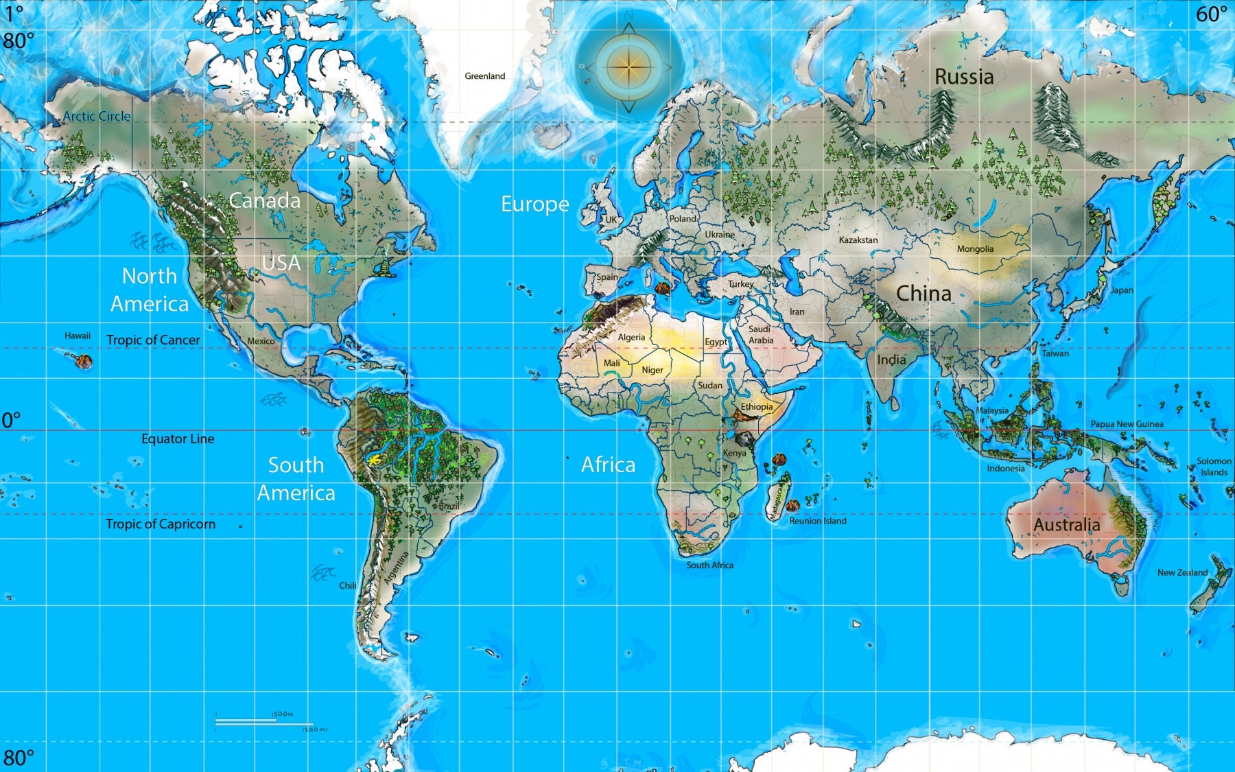
The Mercator projection is considered one of the most important and influential world map projections still used today. Developed in the sixteenth century by Gerardus Mercator, this projection was created for sailors who navigated using a compass.
Because the Mercator projection allows map users to draw a straight line on the map that represents a constant direction of travel, the same as the direction indicated by a compass, the Mercator projection has been recognized as an essential tool for navigators at sea. This paragraph explains why the Mercator projection is still a good map tool for most maritime navigation companies.
The same factor that has aided sailors for hundreds of years has created a fundamental flaw. The Mercator projection maintains direction but alters area and size, or scale, as you move away from the equator. Areas close to the poles become grossly enlarged, while equatorial areas have a greatly reduced appearance. For example, Canada is grossly enlarged in the Mercator projection, while Greenland appears to be many times larger than it truly is. Lastly, Antarctica is the largest area shown on the Mercator projection.
In actuality, Africa is much bigger than Greenland. The area of Africa could contain approximately 14 Greenlands. Very few flat maps portray this fact accurately. Likewise, South America’s area is grossly reduced in size, while Europe and North America appear bulky and oversized. The distortions that are present are not errors. Rather, they are the results of mathematical processes that were developed hundreds of years ago.
To help you understand why there cannot be a flat map of the Earth that is perfectly accurate, perform a very simple experiment. Take an orange and peel it. Afterwards, lay the peel flat on a surface or table. You will probably notice that the peeled surface will tear, crinkle, or stretch. The same thing occurs when you flatten the curved surface of the Earth. Something must change.
To manage this issue, a cartographer uses mathematical projection systems to create a flat map of the world. All different types of projections convert points from a sphere onto a plane.
According to mathematical projection systems, four different attributes, area, shape, distance, and direction, cannot be maintained simultaneously. At least one must be altered. Every model is a model that only shows some characteristics of reality and omits others to create a model of reality, meaning the use of “reality.”
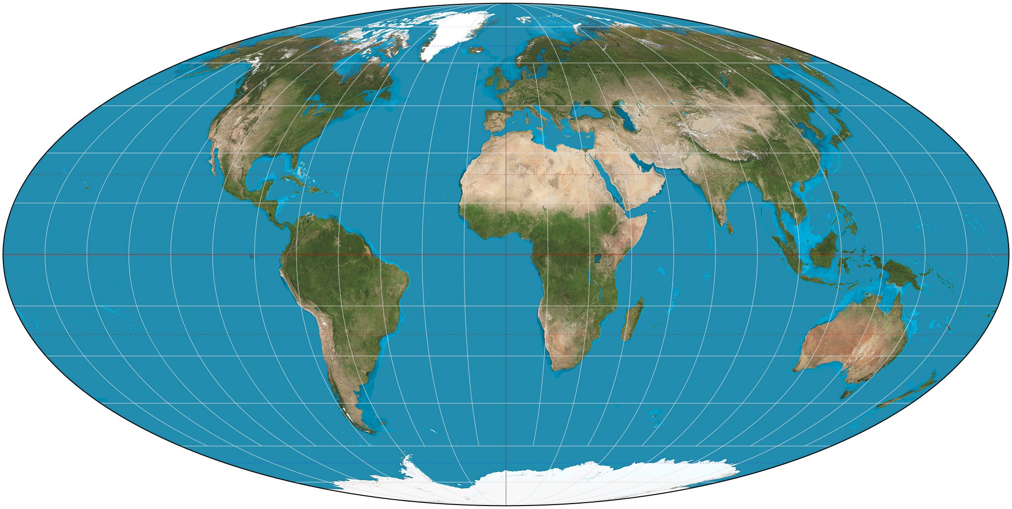
Since map projections come in various kinds and serve different purposes, there is no one best projection. All equal-area maps show land size in the correct proportion. Therefore, the size of each country can be properly compared to Europe and North America as it should be in terms of actual size. The trade-off for equal-area projections, however, is that the shape of landmasses becomes distorted. A person looking at equal-area maps may feel that landmasses in the southern hemisphere have been elongated or distorted.
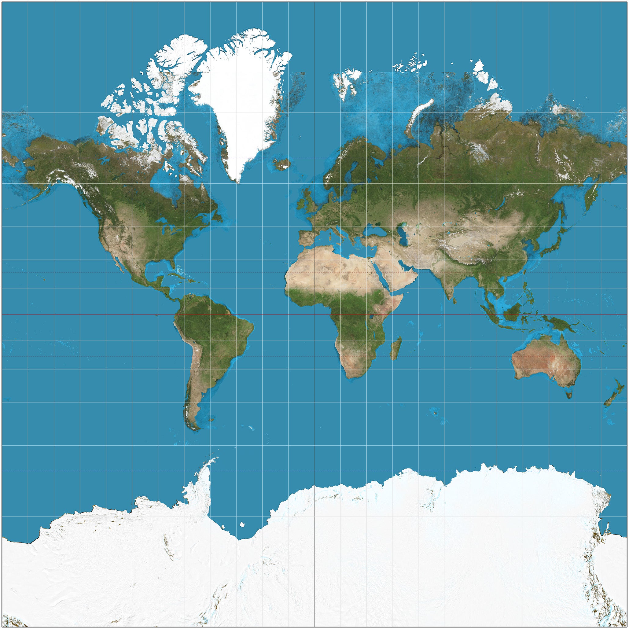
Conversely, conformal maps preserve local shape and angle while distorting area. Mercator maps fall into this category, as they accurately represent coastlines and angles, making Mercator maps a preferred way of navigating. However, they exaggerate the relative size of continents located at high latitudes.
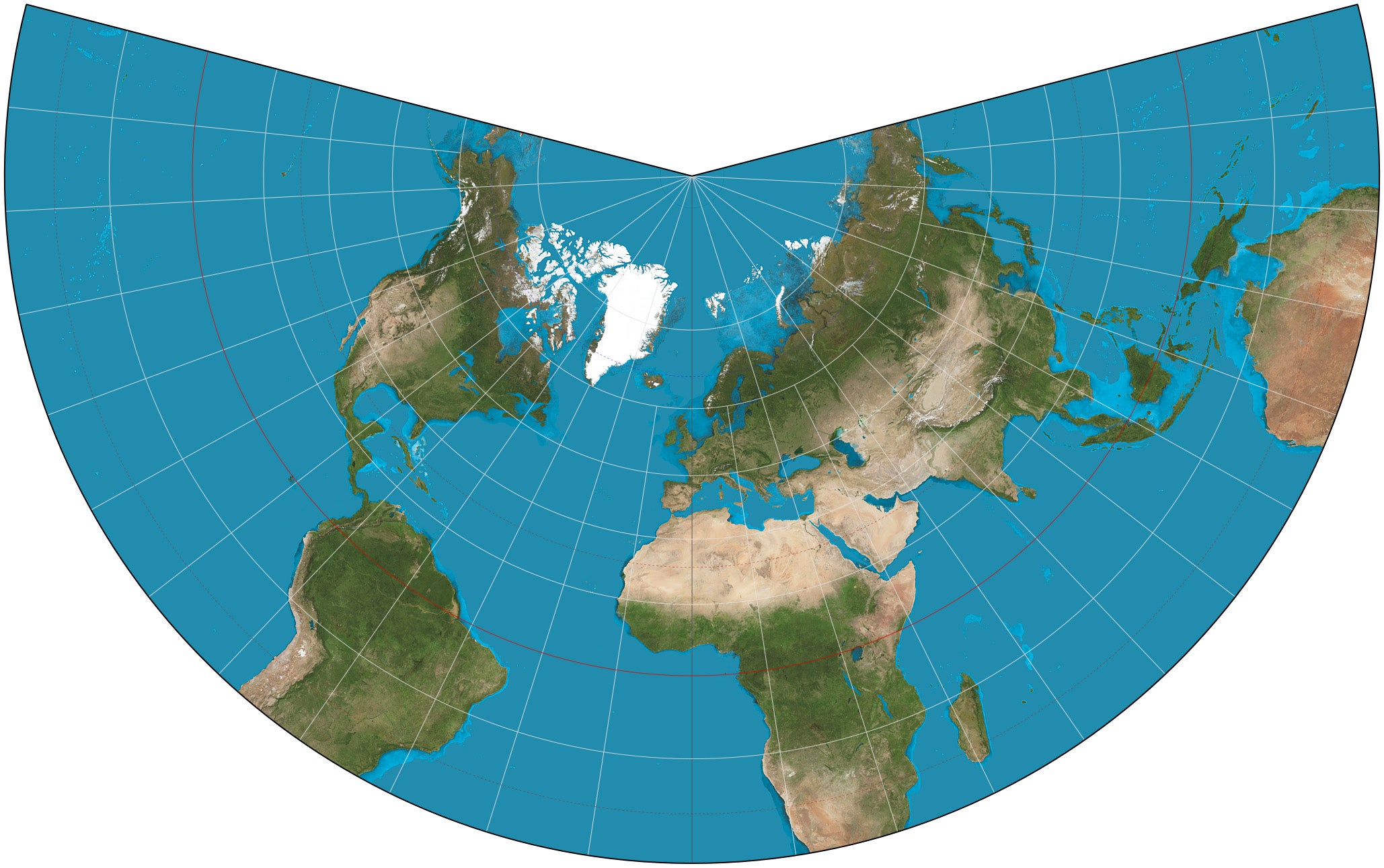
Compromise projections are designed to achieve a balance between the two previously mentioned types of projections by striving for equidimensionality to the greatest degree possible. A compromise projection does not meet the definitions for any of the previously described map projection types.
As a result, overall distortion is reduced, and the final result appears more visually pleasing than either of the previously mentioned approaches to mapping. Many world atlases use compromise projections, which result in a final product that appears balanced but has much less overall accuracy than either of the two previously mentioned methods.
Each of these methods serves a very different purpose. Therefore, there is no universally correct way to represent the Earth. Problems arise, however, when a method that was designed for a specific task is used as an all-encompassing way of representing the Earth.
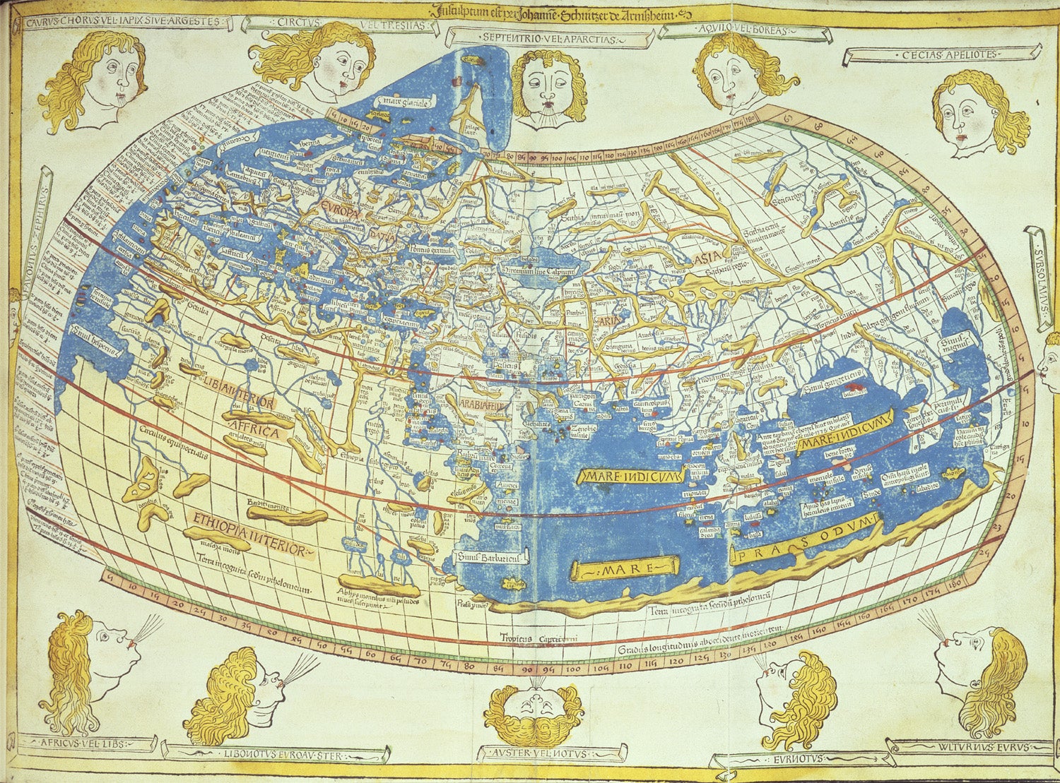
For many thousands of years, mankind has sought to produce accurate representations of the Earth. For example, Ptolemy’s second monograph contained the formula for latitude and longitude as a system of coordinates on the globe. Ptolemy’s system became the foundation of modern cartography.
During the Age of Discovery, maps were designed for practical use by traders and sailors. They did not require an accurate representation of the landmass of a continent, only a way to navigate accurately. The Mercator Projection met that requirement and, by default, became the standard for classroom maps.
Projections emerged over time to compete with the Mercator and to correct its distortions. The Gall-Peters Projection challenged the Mercator by exclusively exhibiting area instead of distance. The Robinson Projection attempted to make all areas equal on the map. Both projections attempted to fix perceived flaws of earlier maps. However, none of these projections eliminated the distortion of flat maps entirely.
Although the effects of distortion on maps extend beyond teaching geography, maps have viewpoints in the same way. When maps show the areas of northern countries as larger than southern countries, northern countries are viewed as dominant or central. When northern countries are viewable as smaller than southern countries on a map, latitude is perceived as insignificant, meaning less diverse.
Educators and scholars contend that the way maps are drawn aids the perception of a hierarchy of global powers.
Maps affect the way people view distance between countries. This makes it difficult to judge travel time or route, as well as distance when traveling from one country to another. When viewing a map, the travel route from country to country may appear more direct or may look more complicated than it actually is.
Knowing these influences does not mean maps should be rejected. Rather, maps should be viewed with an understanding of their influences. Maps reflect a set of priorities from the mapmaker as well as the context in which they have been created.
The advancement of digital technologies has changed how mapping and mapping technologies are used. Digital globes and interactive maps provide ways to survey Planet Earth in three dimensions. Users can rotate, zoom, and view Earth from different perspectives in a single view instead of forcing Earth into a flat representation.
GPS technology has changed how people know where they are and how they navigate. GPS-enabled satellites can monitor and relay an individual’s location in real time as they move from one location to another on the Earth’s curved surface. As a result, there is less need for people to use printed static paper maps for many purposes. Navigation now occurs on screen with real-time updates and changing perspectives.
However, even with these advances, flat maps continue to be widely used in today’s educational systems, media, and daily life. Flat maps are easy to produce, distribute, and recognize. Their familiarity has made them powerful tools. However, it is easy to overlook their limitations.
Educators are increasingly focusing on teaching students how to critically evaluate maps. Interactive mapping tools allow students the ability to enlarge, shift, and compare continents as they see fit. This activity illustrates how reducing distortion in global projections drastically affects people’s perspective of the world.
In many cases, publications create multiple global map representations to provide the reader or viewer with context. For example, a reader may see an area-accurate representation of the world next to a Mercator projection to observe how the size and shape of an area can change. These types of map publications do not intend to replace traditional forms of maps. However, they offer a different perspective.
By using a context-driven approach, maps are seen as arguments rather than truths. Each global map makes a statement about what is important or not important. By learning to assess the argument presented, students develop a greater understanding of geography and gain heightened media literacy.
Maps can make it seem as though they are accurate representations of reality. However, this is not the case. Maps are simplified forms of reality and reflect the assumptions made by mapmakers. Maps cannot show everything at once.
When individuals understand what a map does not show, they are better able to use the map for its intended purpose. Direction-preserving maps assist navigators in navigation. Area-preserving maps assist users in fairly comparing areas. Compromise maps provide users with general reference maps. Problems arise only when a user expects one type of map to address all issues associated with maps.
Maps are still vital to education, exploration, and planning today. Maps serve as the foundation for students to learn about the planet, as long as they are aware of the limitations of the product being viewed.
Like these kind of feel good stories? Get The Brighter Side of News’ newsletter.
The post Global maps can distort the way people view the world appeared first on The Brighter Side of News.